
Pricing: where you sit and what moved
The Pricing page shows the full price structure of your category shelf — the spread, where the volume clusters, where you sit inside it, which competitors moved this period, who is discounting, and who is running an actual promotion.
Background: why price needs a shelf view
Most brands know their own price and their two or three named rivals' prices. What they rarely have is the shape of the whole shelf: the tier where most ranked products actually compete, the gap between list price and street price, and the difference between a permanent markdown and a live promotional push.
That distinction matters commercially. A competitor sitting 30% below its list price is telling you its RRP is decorative. A competitor running a limited-time deal badge is telling you it is spending to buy velocity this week. Those two facts lead to different responses, and legacy market data usually collapses them into one number. Rove separates them.
The headline figures
Set median — the midpoint price across the tracked shelf. This is your anchor, not the average; averages get dragged by premium outliers.
Cheapest and Premium ceiling — the full span, which usually includes accessories and parts as well as main units.
Your price (RRP) — your stated price and its percentage difference from the median (if anchored).

Pricing Distribution
A scatter of every tracked product against price. Each marker is a product; the vertical line through it shows how far that product's price has moved across the tracked periods, so a long line means a volatile price and a dot means a stable one. The median and your own price are marked. Click any marker to open that product's detail.
Read it for clusters, not individuals. A dense band tells you where the shelf genuinely competes; empty space tells you where a price point is uncontested — which may be an opening or may be a price point nobody buys at.
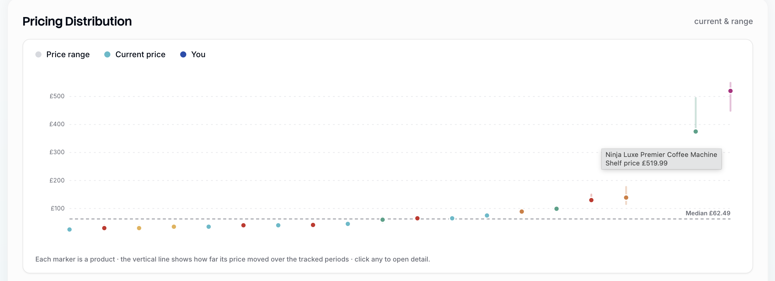
What this pricing distribution telling you?
A written read of the distribution: the practical volume tier, the category leader's price as the benchmark, your nearest neighbours by price, and the meaningful moves this period.

Price & Rank Over Time
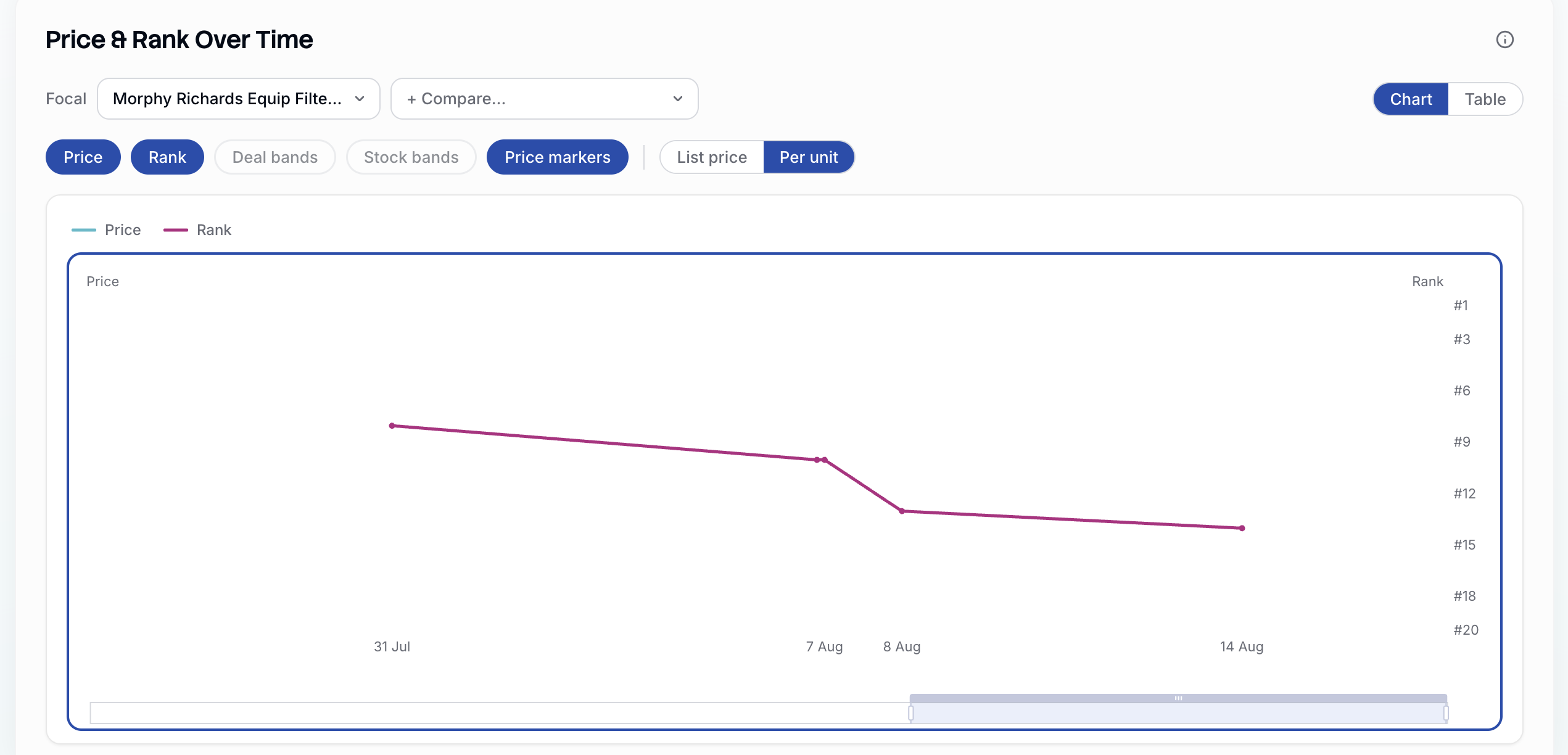
The core analytical chart. Pick a Focal product — yours by default, marked with a star — and add competitors to compare. Toggle between:
Chart and Table views
Price and Rank series
Deal bands and Stock bands — shaded periods where that product was on deal or had a stock event
Price markers, and List price versus Per unit
The question this chart exists to answer is whether price moves and rank moves travel together on this specific shelf. Sometimes they clearly do; often they do not. Overlaying deal bands is what separates "they cut price" from "they ran a promotion" — the second usually explains a rank spike better than the first.
Price moves this period
Every competitor whose price changed since the last capture, with the old price, new price, absolute change and percentage. Sorted by size of move. This is the list to scan if you have thirty seconds. Look out for a show more button to reveal the full list.

Selling below list price
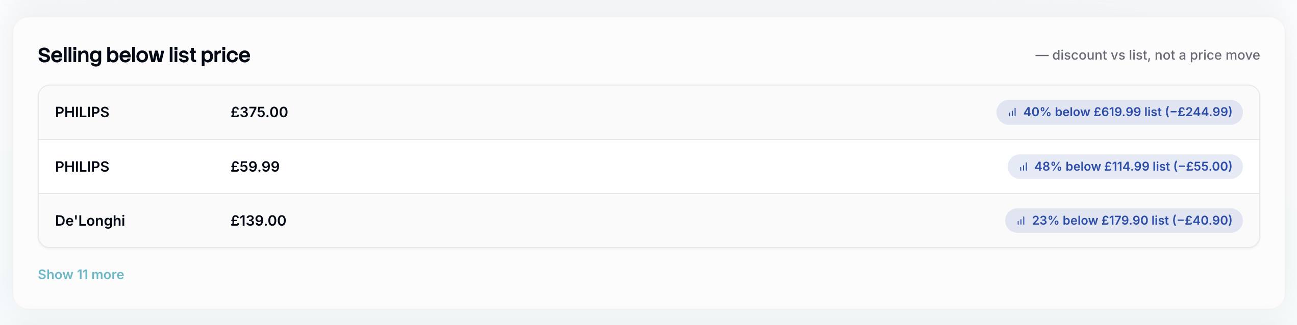
Products currently trading below their own stated list price, with the discount in percentage and pounds. This is not a price move — it is a standing gap between RRP and street price. A competitor permanently 30–40% below list has effectively repriced, and its list price should not be used as your benchmark. You can hit show more to reveal the full list.
Promotions
The promotional picture, kept separate from routine discounting because it behaves differently.
Counters — how many deals, vouchers and Prime-exclusive offers are live.
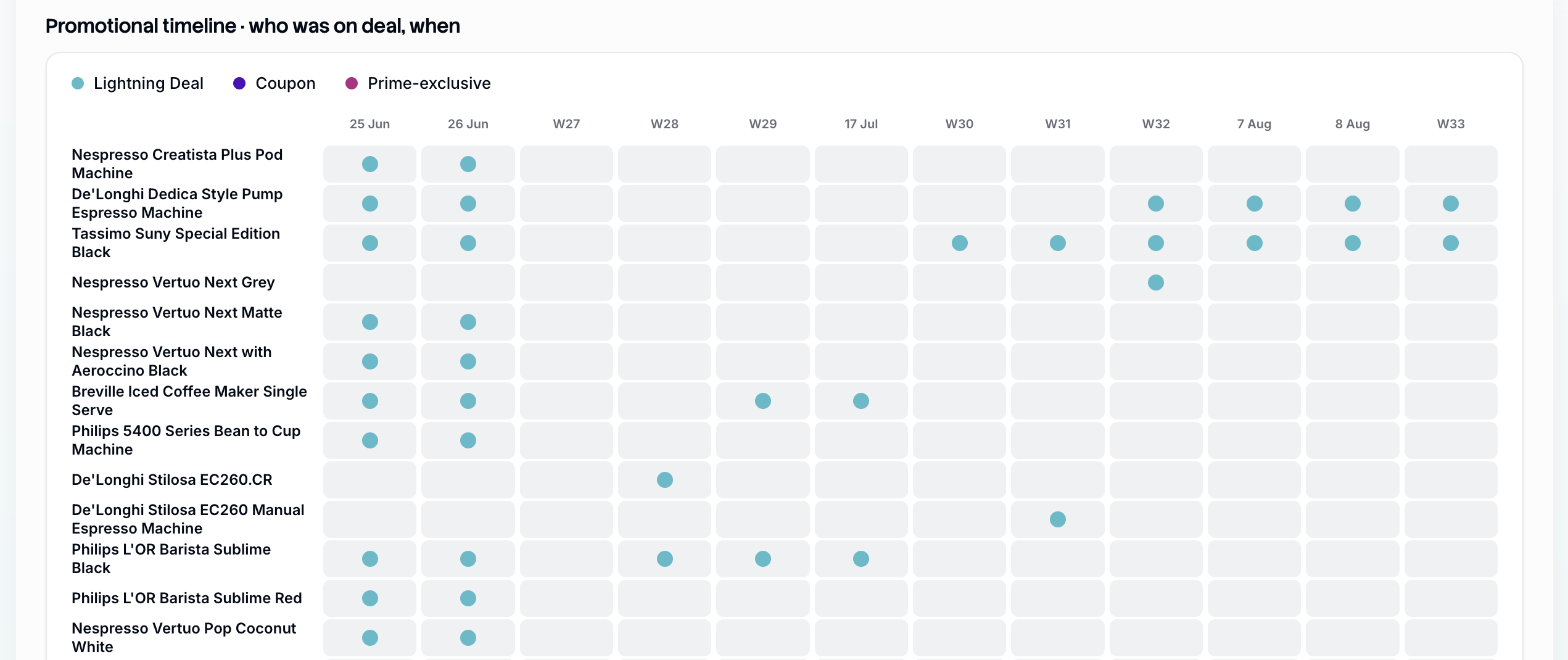
Promotional timeline — a grid of who was on deal in which week, with a per-week active count. Read down a column: concentrated activity in one week suggests a coordinated wave (a seasonal event, a category-wide push) rather than independent decisions.
Live promotions — each active offer with its badge type, discount, promotional price and list price, plus a note on whether a voucher requires Subscribe & Save or is open to all buyers.
Promo state changes this period — who added a deal and who came off one.
A shelf with almost no live promotions is a genuine finding: it means a modest launch voucher or deal badge would stand out immediately. A shelf saturated with deals means your undiscounted price will look expensive regardless of your RRP.
Price awareness:
Shelf price is not always what a shopper pays — some listings add a delivery charge, which the Stock page surfaces. Per-unit prices on multipacks and accessories can distort the cheapest end of the range. And a price is evidence of intent, not of sales; nothing on this page reads volume.